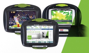
Heading into IHRSA, I was really looking forward to seeing what was coming from all of the manufacturers regarding user interface on cardio equipment. The industry has been focusing hard on user interface in the past few years so this show was a good litmus test. As I walked the floor and saw what other companies had to offer, it really made it obvious why the mainstream technology industry thinks fitness equipment has some of the worst user interfaces in the world.
State of the industry for user interfaceIt's easier to point out what was done right than what was wrong on most of the equipment there, purely because so much of it was wrong. These interfaces have evolved into what is best described as a “dog’s lunch”; a bunch of random features stuck onto a design from the 90's with all the care and craftsmanship of a Ford Pinto. Who really wants to update their Facebook status from a treadmill? I'm sure there's one or two people who do, but wasn't it really just added so there would be another check box filled in on the feature list? And do we really need another solitaire game? Just because you CAN do something, doesn't mean you should! But, I digress. Let's talk about what can be done right:
Simplicity
 One of the most challenging parts of designing an interface for use in a club is keeping things simple. It needs to have all the advanced functionality that people expect these days, like virtual running videos and media integration, but at the same time someone who has never seen the device has to be able to walk up to it and start using it immediately. Some of the interfaces currently available solve this better than others, but unfortunately the simpler interfaces are found on the simpler devices, and it's probably lack of features that give them their ease of use, not any superior design.
Education
When someone approaches a device for the first time and they immediately start a manual workout, are they given any hints that there is more available to them? As they use the device, does it help the user discover additional functionality? And when they finish their workout, does it also take that time to educate them more about the device? Many times people don't use advanced functionality simply because they don't know it exists, or they don't understand the benefit. Expecting them to watch a video or read the manual is unrealistic. You need to understand how they use the device, and then integrate education into its use.
Interaction
Just because the device has some snazzy new touchscreen, doesn't mean all of the users interactions should happen via the screen. While a touchscreen is great at a walking speed, start jogging or running and you'll quickly discover how frustrating they can become. This goes back to user EXPERIENCE, not user INTERFACE. This is one area that the industry has been experimenting with various ideas: paddles, knobs and levers for changing speed and incline, physical keys for quick speeds, etc. By combining the best of both worlds, you can maintain a clean look and feel on the device, but still carry forward the excellent user experience that physical controls can yield, especially when running.
What’s Next?
Now that the industry has finally broken free of the shackles of LEDs, it's time to acknowledge there is no technical reason that the user interfaces on these devices can't be just as cutting edge and innovative as the best ones out there. It means looking outside the industry for design cues, and using the general design insights that are made on other kinds of devices. Ultimately, it means figuring out how they apply this to cardio equipment.
This article was written for the May 2015 issue of Club Industry Resourcebeat.

